Saturday, 22 January 2011

Evaluation

Question 1- In what ways does your media product use, develop or challenge forms and conventions of real media products?


Question 2- How effective is the combination of your main product and ancillary texts?
When combining our ancillary texts with our main product we tried to keep a constant intertextual reference flowing through out. We found this relatively easy as our chosen genre of acoustic pop is majoritivly solo artists which are also musicians so any images of the singer would have the running theme of a guitar through out.

Due to the fact our image on our advert was not done in the same way or manner as the digipak images we added a very small image of the front cover of our digipak t link the images together in that way.

A key aspect of making a good digipak and advert is making it simple, with not too much going on all at once ensuring there is a key focal point and something to draw in your focus.

With our advert being in grey scale we thought we should keep this running through to our digipak, however we thought that by making the digipak front and back into greyscale would not make it stand out, with this in mind we made the front and back in colour and made the inside of the digipak into grey scale to keep some relation with the advert.

By using a image from our day of filming as the key image on the advert this immediately relates the advert to the video.

We also kept the mise en scene similar through out, keeping tom in layed back smart casual clothing within the images on the digipak, advert and video.

Question 3- What have you learned from your audience feedback?

Our process or recieving feedback started when we first approached our target audience with our hand drawn designs of the digipak and advert, the videos of which can be found earlier on in my blog. We were able to process their opinions and incorporate their ideas into our further drafting of our products. All of the people we asked were within our target age range and were of mixed gender, many of which were media students or simply music fans so had a basic understanding for music and music videos. Most of the target audience were able to desifer the genre of music for themselevs when watching the video or viewing the advert and digipak.


Question 4- How did you use media technologies in the construction and research, planning and evaluation stages?

Research-
When initially researching into a song choice i used my itunes to research my own library of songs to see whether i immediately had any specific type of song genre i wanted to make our video on. Once we had chosen the genre of acoustic pop i researched into it further, using the internet, through google and places like youtube to give me a basic idea of how the acoustic pop genre is portrayed. I also looked into adverts and digipaks using google again however i also went into some music stores and looked at some of the album artwork. For the adverts i went into my local large magazine store and looked through some music magazines to gain an idea of how and what acoustic pop genre adverts were like. Making my mood board helped me incorporate all the ideas and different views on the acoustic pop genre into one big picture that displayed the difference and similarities that the genre contains. I also deconstructed 2 music videos and 2 adverts to research into the generic features of the acoustic pop genre through out different mediums.


Planning-
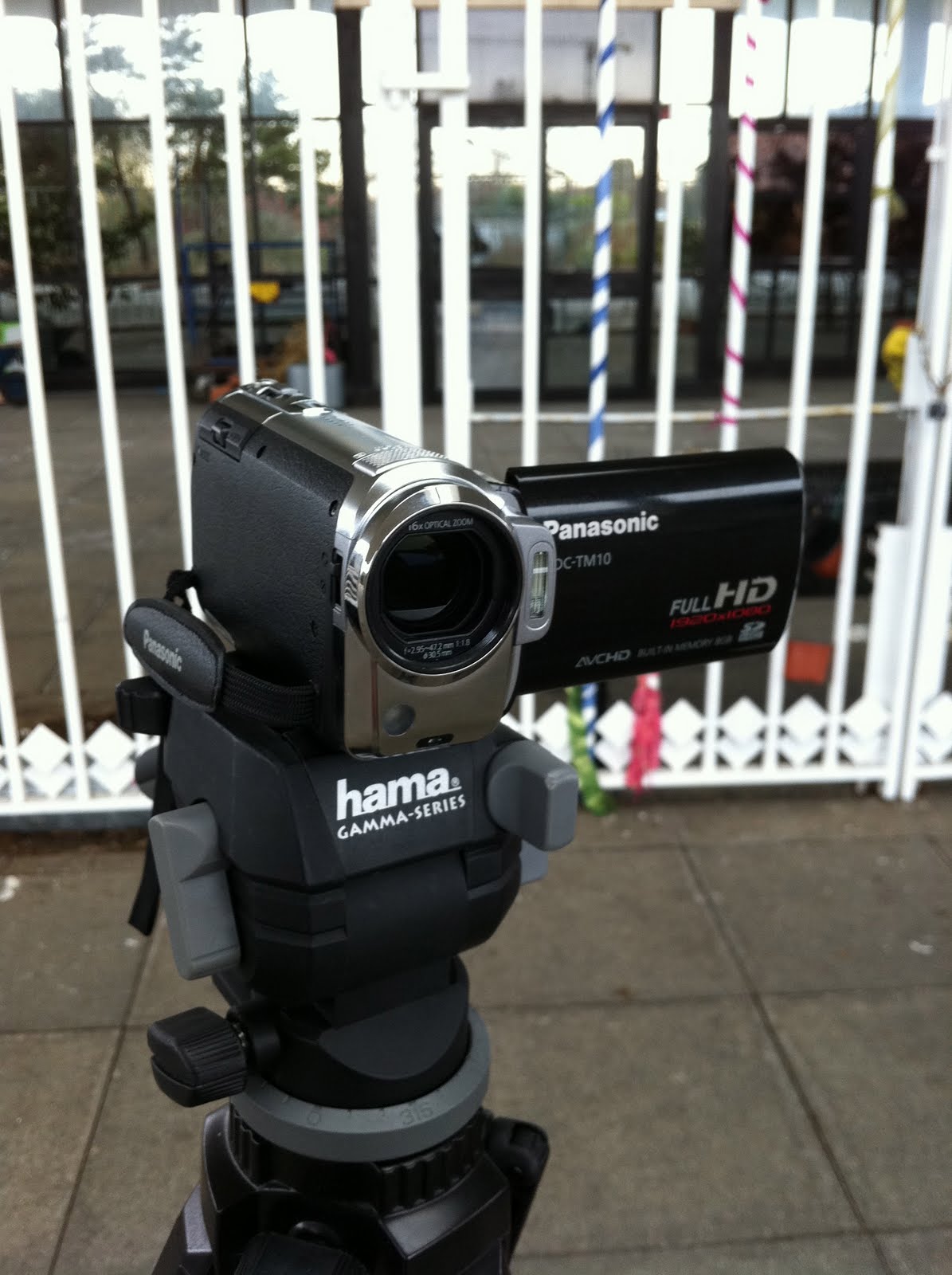
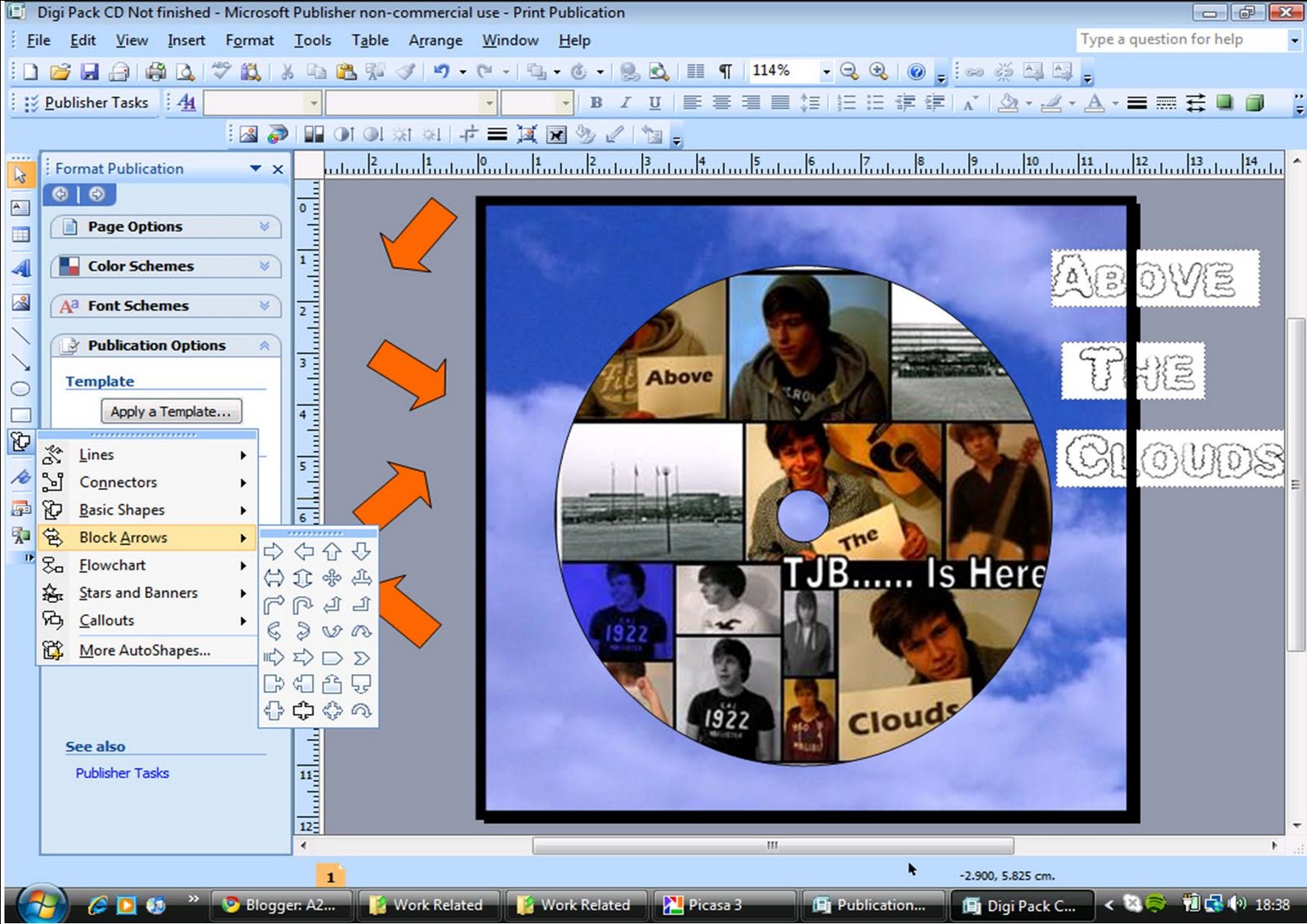
I started by making storyboards of my ideas of shots through out the video to different parts in the music, i then scanned these onto my computer to allow me to make them into an animatic which i made on imovie to give a greater idea of how we cold apply the different shots to the music. When recording the target audience feedback to our hand drawn advert drafts and digipak we used a full HD Panasonic camcorder and a jessops tripod to record our audience response which we then put together on imovie. When planning our shooting we used the BBC website for weather updates on our scheduled day of filming, we also made use of google maps allowing us the most direct route to our destination. When creating our final advert and digipak drafts i used publisher to create them and windows photo editor to manipulate the images which i wanted to used within my ancillary texts.


Construction-
When filming out music video we used a full HD Panasonic camera and a jessops tripod. All of our editing was done on Apple imovie.


Evaluation-
For our evaluation we used the same camera and tripod that we used when filming the target audience feedback and music video. We used imovie to piece together the main bits we wanted to mention through out our evaluation of whether our products challenge the forms and conventions of real product, we used pictures of out final ancillary texts in the video and clips from our music video. We added our voices over the top of the clips or images to explain why and how we had done what we did.

Thursday, 20 January 2011

Target audience response

Once we had created our final products we displayed them to a sample of fellow pupils from our target audience. We asked them questions about our products and the results are shown in the videos below.


Saturday, 15 January 2011

Final product: Film


Through our analysis of music videos we used the key features that we deconstructed and incorporated them into our own video.

-The video is rather performance based as he is singing and playing the guitar through out the video.

-We've used a lot of transition editing between different shots to differentiate as the video is pretty plain due to the fact the video is simply of the singer, with the occasional setting shot.

-The camera work we used is generally similar as the shots are mostly close up or extreme close up, however we have used different angled shots to show some variation.

-The focus of the video is solely on the singer as he is the only person in the video.

Friday, 14 January 2011

Final product: Digipak


Deconstruction-


With our from cover we thought it worked best when the images were symmetrical, we also applied a white box to frame and make our artist name of 'TJB' stand out well. We played about with the images in different positions as they are all different colours and some didn't go well next to each other. We outlined the images with the grid like black outline, however left the edge of the whole cover boarderless. We also moved the position of the images containing the album name. We collectively thought the names stood out best being positioned just under the artist name.


For the inside we liked the idea of a location image so we used 2 pictures that we took on our day filming and joined them together, trying to ensure the tops of the buildings were at the same level. We had previously put the images into grey scale as this set a nice tone within our digipak. We applied some logos along the bottom of the left hand side of our digipak and blocked out a strip in the middle where we wrote the artist name and song title.

With the CD we edited the photo so that the main image was in grey scale, however we picked out the colour from the kiss print and kept that red, we thought this looked very artistic. We applied the artist name in white as it stood out on the darkness of background image.


With our back cover we kept the same image from one of our drafts however changed the text as this allowed us to place a bar code and logos along the bottom of the cover as this makes it look much more realistic and professional. We also incorporated the artist name and album name on the back, we applied it sideways as this worked well and differentiates from the other text.

Final product: Advert

From our mini questionnaire results we decided to go with the advert that the majority of our target audience preferred. We were happy wit this decision as we felt this advert would work better when placed in a magazine.

Decision on final advert

Advert 1-

For this advert we applied the image that we had edited to grey scale first, filling the entire width and almost all the length, however we decided to block out some of the image at the bottom so it didn't matter that it didn't fill the whole page. We applied a block of plain black colour onto the bottom third of the advert and wanted all the test on top of this to be white. With any text on the image being in black.

We used the Digipak front cover image onto the advert to give it a more realistic look. We also used the logos of 'Q' and 'NME' magazines, when applying reviews to the advert to make it look more professional.


Advert 2-

For this advert we used a image we took on our day filming as the main image and focus of the advert. We also changed the image into grey scale as we believed it brought a better tone to the advert displaying the genre more. Due to this we also kept the writing in context with the image. We added the digipak front cover to the advert to promote the selling of the album as we had seen this on many adverts previously.


We started with a plain black background as we thought text and images would stand out on it more. When we added the image, we didn't want it to cover the whole of the top 2 thirds so we left a black boarder around it as we thought this framed the image well. We played around with the artists name and album name in both black and white and in different places on the advert however we felt the black stood out more and draws you well to the album and artist name. We added logos such as 'Q' and 'NME' for reviews which from our deconstruction is a key point of the advert. For the logos such as 'itunes' and 'amazon' we decided that as they weren't promoting the song we would banner them off in a different colour. With keeping the colour scheme going we simply applied a white strip along the bottom of the advert and placed the logos on top of it.


We asked 10 people from our target audience to fill in a miniature question consisting of 3 questions. We were hoping to receive information on which of the adverts shows above they preferred and why.
Below is a sample of 3 of the responses we received.


The general consensus was that advert number 1 was more attractive and more likely to been seen in a magazine or as a advertising poster.

Thursday, 13 January 2011

Video advertisement

Once we had made our music video we found a great application on imovie that allowed us to create a motion advert. This advertises our artist and his album.


Monday, 10 January 2011

Editing

With the editing of our video we were quite lucky in the fact that Tom had an Apple Mac of his own so he got a chance to play around a little bit with the editing at home as well. We all met up inside and out of school to get the editing done to the best standard we could. Our editing went smoothly, mainly due to our large range of shots which we were able to piece together well.


Thursday, 6 January 2011

Shooting


Our day of filming went quite smoothly, the sun came out for a little bit however it was still very chilly through out the day. We set off for Milton Keynes at about 10 o'clock, arriving at around 11. All the car parks surrounding the train station were quite busy so we had to park a little walk away, however while walking to the station we found some good places which we could film some parts of the video at.
When filming we ensured we filmed the shots where we were hoping to do lip syncing quite a few times as we would have to choose the best shot in time with the song lyrics. This was going to take up the majority of the day as we wanted to get shots of all the lyrics lip syncing and then when it came to the editing and we had ones that weren't so good we could use our shots where Tom wasn't singing.
Me and Ollie shared the filming of the scenes Tom was in, using the tripod and dolly wheels to help us with specific shots. Tom shot the majority of the setting shots. Shooting took quite a while as we wanted the most of the shots to only have Tom in and due to the fact we did a lot of the filming around the train station there was people constantly coming and going, this put slight hast to the filming however it gave us time to think about the shots and how to improve them, or where to shoot our next shot. We managed to get all the filming done by late afternoon, which gave us time when we returned home to watch the filming through and have a general view on ideas of how we could put some shots together.


Thursday, 23 December 2010

Draft of Digipak + Advert

Digipak draft 1-


Front cover


As a group we had previously discussed the idea of using the pictures in blocks or squares on the front of our digipak. We took this idea and used it in our draft. We used the images from a photo shoot we did of Tom especially for the digipak. This worked well as we took them in front of a white screen allowing all the focus to be on our solo artist. We also brought the album name into some of the photos as we had a good idea before pohotographing of how we could arrange them on the front cover.


On the front cover we boardered all the images in black, outlining them and defining the break is the different pictures we used. When placing the name of our artist on the digipak we decided to keep the text in the same context of the image box in which it was placed, we did this by putting a slight shadow effect on the text and made it grey scale.
Inside

For the inside case we again used the images from the photo shoot. For the left hand side i pieced together 2 images, one colour image and one black and white. I cut them so they fitted together well, unlike my other tries that resulted in Tom looking like a horse.

Leaving the image on its own left the page a little too bland so we placed some of the lyrics from one of the songs onto the picture, however simply having the text in straight lines did not make the picture better, it blocked the image and didn't look very attractive. I then had the idea of the text all being written in a spiral however this wasn't viable on publisher so we resulted to making circles and moving each one to fit inside the previous circle of text.


For the right side image and CD we used the same picture. We kept a slight outline on the image on the CD and just made the background image slightly transparent. The only writing we applied to the CD was the singers name and the album name, we left the inside pretty basic as its not a focal point of the digipak.


Back cover

For the back cover we decided to crop one of the images from the photo shoot to leave only half of the main image. We edited the image a lot by altering the colour and adding a blurred effect round the edge, i feel this image worked well and is a definite solid idea for our final digipak.


We placed all of the song names in a basic font down the right hand side. We also partly boardered the image and sides with the artists name as we thought it framed the image in a quirky way.
Digipak draft 2-

Front

Again in this digipak we used the blocks/squares of images of our artist. However in this one we used more images and applied then in different sizes to the front, we also put in some pictures of landscape shots to fill it out. For the album name we decided to try and see what effect it would bring across if it was placed in a different way. We toyed with having the pictures containing the album name in different ways other than straight across the middle. We then applied the other images around the album name.


We decided to leave a gap for the name of the artist as we tried placing it on top of the images however it didn't stand out enough so we cropped some of the images to allow us to have a blank space which resulted in the text standing out more.


Back

For the back of the digipak we have gone along the same lines as the other, by using an image that covers half the back allowing space for the song names on the other half. We minimally edited the image as we felt the image itself had somewhat of a warm tone of colours to it. The song names have just been done in a basic Word font in a Navy colour that has been drawn from the image on the back.


The background of the image has been left the same so we didn't have to cut around the image. Even though the colour varies it incorporates the singers shadow into it well, making the image look more professional. We also added a bar code to make it look more realistic.


Inside

For the left side of the inside we used a shot from our music video, the shot may only be of a building and cars but we believed it worked well, and with it being in grey scale it brought a different aspect to our digipak. With the artists name we tried to create it in cloud shape writing, this was tricky to do but i think it works well as it also relates to the album title. We also added a frame to the majority of the picture, leaving a banner like space at the bottom which we filled with some song lyrics.


For the right side we again kept the cloud theme running through this digipak by applying a sort of sky with clouds behind the image on the CD. The CD itself is i replica of the front cover however we added the album title on it again as we thought it would stand out better with more cloud like writing to link the inside pages together.


Advert Draft 1-
We created this advert on publisher as it allowed us to do the most editing of images, text and manipulating of colour. From looking back at our deconstruction of adverts we took the generic features and tried to apply them to our own advert.


I wanted the image to cover at least half of the page, however with just the one image it looked empty and boring so i inserted 2 other little pictures along the bottom and the side, which i deleted the background out of allowing them to sit nicely on top of my original image. Prior to this i had edited and manipulated the images i was wanting to use to make them look more professional. For the 5 star rating i simply used clip art as it was the easiest to apply to my advert quickly.


I also used logos such as 'itunes' and 'HMV' to make my advert look more realistic. I kept with a common colour scheme throughout the text. Those that worked the best when placed on top of the black background, all of which i had drawn from the main images.


Advert draft 2-

We also created this advert on publisher as it allowed the most editing to be done. We firstly applied a plain black background and placed an image that we took on our day filming on top. We left a gap round the edge of the image as we felt the black background worked well as a boarder outlining the image. We put the artist and album in basic font and altered the colour depending on where we placed them on the advert, as we placed the album name over a very light white spot in the image we decided black text would stand out the most, this is in juxta position the the artist name as it is white text on a much darker background.


For this advert instead of using the stars off clip art we just inserted a star shape from the tool bar, we then filled them with yellow. We placed the song names from the album in a much smaller font at the bottom of the advert as they aren't a key selling point. As the image was quite dark at the bottom we made the text white so it would stand out a little bit. We then applied the logos such as 'itunes' and 'HMV' to give the advert an authentic look.


Advert Draft 3-

For this advert draft we kept the image in colour so therefore wanted a coloured background instead of a black one. We used a vibrant blue as we thought it might bring more focus to the image and advert. We went along the same line as our previous advert with the layout as we thought it worked well. We made the stars using the shape tool from the tool bar again as they seemed brighter than the clip art stars.

After previewing the advert with the blue background we decided it was too out there to work well so we changed it into black. Again like the previous advert we added the song names and release date at the bottom of the advert in white.