Front cover
As a group we had previously discussed the idea of using the pictures in blocks or squares on the front of our digipak. We took this idea and used it in our draft. We used the images from a photo shoot we did of Tom especially for the digipak. This worked well as we took them in front of a white screen allowing all the focus to be on our solo artist. We also brought the album name into some of the photos as we had a good idea before pohotographing of how we could arrange them on the front cover.

On the front cover we boardered all the images in black, outlining them and defining the break is the different pictures we used. When placing the name of our artist on the digipak we decided to keep the text in the same context of the image box in which it was placed, we did this by putting a slight shadow effect on the text and made it grey scale.

Inside
For the inside case we again used the images from the photo shoot. For the left hand side i pieced together 2 images, one colour image and one black and white. I cut them so they fitted together well, unlike my other tries that resulted in Tom looking like a horse.
 Leaving the image on its own left the page a little too bland so we placed some of the lyrics from one of the songs onto the picture, however simply having the text in straight lines did not make the picture better, it blocked the image and didn't look very attractive. I then had the idea of the text all being written in a spiral however this wasn't viable on publisher so we resulted to making circles and moving each one to fit inside the previous circle of text.


For the right side image and CD we used the same picture. We kept a slight outline on the image on the CD and just made the background image slightly transparent. The only writing we applied to the CD was the singers name and the album name, we left the inside pretty basic as its not a focal point of the digipak.

Back cover

We placed all of the song names in a basic font down the right hand side. We also partly boardered the image and sides with the artists name as we thought it framed the image in a quirky way.
 Digipak draft 2-
Front
Again in this digipak we used the blocks/squares of images of our artist. However in this one we used more images and applied then in different sizes to the front, we also put in some pictures of landscape shots to fill it out. For the album name we decided to try and see what effect it would bring across if it was placed in a different way. We toyed with having the pictures containing the album name in different ways other than straight across the middle. We then applied the other images around the album name.
We decided to leave a gap for the name of the artist as we tried placing it on top of the images however it didn't stand out enough so we cropped some of the images to allow us to have a blank space which resulted in the text standing out more.

Back
For the back of the digipak we have gone along the same lines as the other, by using an image that covers half the back allowing space for the song names on the other half. We minimally edited the image as we felt the image itself had somewhat of a warm tone of colours to it. The song names have just been done in a basic Word font in a Navy colour that has been drawn from the image on the back.
The background of the image has been left the same so we didn't have to cut around the image. Even though the colour varies it incorporates the singers shadow into it well, making the image look more professional. We also added a bar code to make it look more realistic.

Inside
For the left side of the inside we used a shot from our music video, the shot may only be of a building and cars but we believed it worked well, and with it being in grey scale it brought a different aspect to our digipak. With the artists name we tried to create it in cloud shape writing, this was tricky to do but i think it works well as it also relates to the album title. We also added a frame to the majority of the picture, leaving a banner like space at the bottom which we filled with some song lyrics.

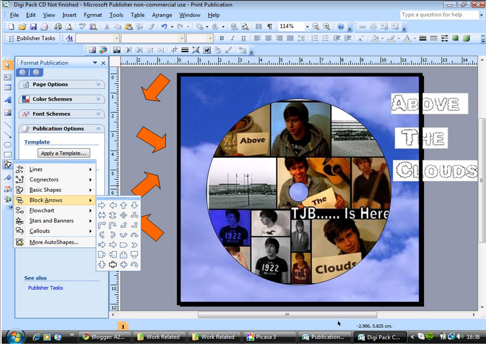
For the right side we again kept the cloud theme running through this digipak by applying a sort of sky with clouds behind the image on the CD. The CD itself is i replica of the front cover however we added the album title on it again as we thought it would stand out better with more cloud like writing to link the inside pages together.

Advert Draft 1-
We created this advert on publisher as it allowed us to do the most editing of images, text and manipulating of colour. From looking back at our deconstruction of adverts we took the generic features and tried to apply them to our own advert.

I wanted the image to cover at least half of the page, however with just the one image it looked empty and boring so i inserted 2 other little pictures along the bottom and the side, which i deleted the background out of allowing them to sit nicely on top of my original image. Prior to this i had edited and manipulated the images i was wanting to use to make them look more professional. For the 5 star rating i simply used clip art as it was the easiest to apply to my advert quickly.

I also used logos such as 'itunes' and 'HMV' to make my advert look more realistic. I kept with a common colour scheme throughout the text. Those that worked the best when placed on top of the black background, all of which i had drawn from the main images.

Advert draft 2-
We also created this advert on publisher as it allowed the most editing to be done. We firstly applied a plain black background and placed an image that we took on our day filming on top. We left a gap round the edge of the image as we felt the black background worked well as a boarder outlining the image. We put the artist and album in basic font and altered the colour depending on where we placed them on the advert, as we placed the album name over a very light white spot in the image we decided black text would stand out the most, this is in juxta position the the artist name as it is white text on a much darker background.

For this advert instead of using the stars off clip art we just inserted a star shape from the tool bar, we then filled them with yellow. We placed the song names from the album in a much smaller font at the bottom of the advert as they aren't a key selling point. As the image was quite dark at the bottom we made the text white so it would stand out a little bit. We then applied the logos such as 'itunes' and 'HMV' to give the advert an authentic look.

Advert Draft 3-
For this advert draft we kept the image in colour so therefore wanted a coloured background instead of a black one. We used a vibrant blue as we thought it might bring more focus to the image and advert. We went along the same line as our previous advert with the layout as we thought it worked well. We made the stars using the shape tool from the tool bar again as they seemed brighter than the clip art stars.

After previewing the advert with the blue background we decided it was too out there to work well so we changed it into black. Again like the previous advert we added the song names and release date at the bottom of the advert in white.

No comments:
Post a Comment